Defining Packaging & Labeling with Visual Metaphors.
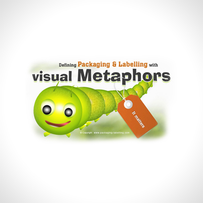
The omnipresent visual metaphor becomes very clear as it builds equity by creating a common reference point between two or more apparently unrelated subjects.
Consumer decisions are made based on the five senses, but it is the visual associations that we respond to much more quickly, such as icons, logos, identities, symbols, shapes, colors—all manner of visual imagery.
With metaphors having the ability to span two or more modes, such as language, visuals, sound, and gestures, the innumerous options are endless. They allow a brand to cross over into new categories and bring the consumer along with them through the use of commonly recognized elements. They allow a brand the freedom and flexibility to develop a platform for consumers to thinkbeyond the original/typical vocabulary and offer a range of possibilities previously not considered as a conscious reference point. All the usual suspects that come to mind that we closely identify with global brands can be deemed visual metaphors. For example, consider Nike’s swoosh, Target’s bulls-eye, Apple’s… apple, McDonald’s arches, the Jolly Green Giant, Starbuck’s siren, Pepsi’s globe.
In packaging design, visual metaphors are used for exemplifying ideas and are the basis of creating a temper, theme, character, or personality for the brand.
Sometimes the metaphors are also locked up with a tagline, as in Origins Cosmetics’ tagline, “Powered by Nature. Proven by Science,” and McDonald’s “I’m lovin it.” These metaphors enhance the brand to expedite the consumer connection to full complement a brand’s communications hierarchy and not complicate it. There needs to be strategic reason for each essential equity element to reside on a package, otherwise it is not just perceived, but considered visual “clutter.”
Packaging speaks in visual language
Our cultural jargon is to communicate in “shorthand,” as we have become a society of visual vibrancy much more so than meaningful conversation based on real words, to communicate or convey an idea.
We expect immediate responses, and our brands expect us to respond immediately. Thus, the visual form of “expression” has become necessary because we live in a tech-savvy world of “simulated” reality, with constant connectivity and synthetic communications.
Visual metaphors work as a device for encouraging insights, or a tool to think with. The actual image itself poses food for thought, without stating an actual proposition. It is up to the consumer to connect with, and translate the imagery, into insights and thoughts…in other words, to make decisions once the new “language” is learned.
When shopping, we have become conditioned to look for the visual cues that represent our brands, almost without thinking on a conscious level. Our packaging “speaks” to us in a visual language our brains instantaneously understand, within a few flash seconds.
This form of imagery is a powerful decision-making tool for over-saturated, over-stimulated minds at retail, to build brand rapport.


