The Art of Packaging: Typography and Color Psychology in Building Brand Identity

Introduction:
In the fiercely competitive realm of consumer goods, packaging transcends its conventional role as a mere protective covering for products; it emerges as a potent instrument for crafting a distinct brand identity. This piece delves into the nuanced interplay between typography and color choices, elucidating their pivotal role in leaving a lasting and memorable imprint that defines the brand through its packaging.
1. The Power of Typography:
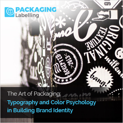
Typography emerges as a potent force in defining and expressing a brand's unique personality. The diverse array of font styles and treatments serves as a visual language, allowing brands to communicate distinct characteristics that resonate with their target audience. Whether it be the bold and modern appeal of sans-serif fonts, projecting innovation and dynamism, or the timeless elegance conveyed by classical serifs, typography becomes a defining element that encapsulates a brand's essence.
The careful choice of fonts goes beyond aesthetics, playing a crucial role in ensuring readability and recognition amid the chaos of retail shelves. When a font aligns seamlessly with the brand's identity, it goes beyond enhancing visual appeal; it becomes a trigger for instant recognition, nurturing a connection between the consumer and the product. Essentially, the influence of typography is not confined to stylistic preferences; it is a fundamental element in the art of packaging design, encapsulating the distinctive attributes that define a brand.
2. Colors as Brand Messengers:
Colors serve as influential messengers, subtly connecting with consumers on a subconscious level. Exploring the fascinating realm of color psychology unveils the distinct emotional resonance carried by each hue. Energetic tones like red and orange, for example, evoke excitement and vitality, making them ideal choices for brands aiming to convey a vibrant and dynamic image.
Conversely, blues and greens communicate a sense of calm, trust, and reliability, proving particularly advantageous for products seeking to establish a solid and dependable presence in the market.
Beyond their emotional impact, maintaining a consistent color palette across diverse product lines emerges as a strategic imperative. This uniformity not only reinforces brand recognition but also fosters a cohesive brand association. The harmonious interplay of colors across different packaging instances contributes to a visual narrative that consumers can readily identify, enhancing the brand's presence and fostering a sense of trust and familiarity among discerning shoppers. Thus, colors serve as powerful brand messengers, communicating both emotion and identity through the lens of packaging design.
3. Evoking Emotions through Packaging:
Packaging transcends its functional role by becoming a canvas for the artful creation of emotional connections between brands and consumers. The amalgamation of typography and colors within packaging design forms a dynamic duo capable of evoking specific emotions and fostering a profound bond with the audience. Through a thoughtful synergy of these elements, packaging becomes a visual storyteller, communicating brand narratives that resonate on an emotional level. Successful brands adept at this art understand the nuanced interplay between design choices and emotional responses.
In essence, the ability to evoke emotions through packaging transforms it into a powerful conduit for brand expression and connection.
4. Achieving Cohesive Brand Identity:
Harmony within packaging design plays a pivotal role in achieving a cohesive and unified brand identity, where the seamless integration of typography and color choices becomes paramount. The delicate balance between these visual elements is not just an aesthetic consideration but a strategic one, ensuring that every facet of the packaging aligns with the brand's overarching identity. Typography and colors should work in tandem, reinforcing each other to convey a consistent message and personality. This visual synergy contributes to the establishment of a strong and recognizable brand presence, fostering consumer trust and loyalty. Beyond the confines of packaging, this harmony extends into the broader spectrum of brand guidelines.
The design of packaging serves as an extension of these guidelines, ensuring a uniform visual language across diverse touchpoints, spanning from product labels to marketing collateral. This coherence establishes a seamless brand experience, reinforcing the brand's identity in consumers' minds and cultivating a feeling of reliability and familiarity that extends beyond individual products.
Essentially, achieving a cohesive brand identity through packaging design necessitates not only the careful balance of visual elements but also their smooth integration into the broader context of the brand's guidelines.
5. Trends and Innovations:
Remaining at the forefront of consumer consciousness requires a keen awareness of evolving design trends in typography and color choices within packaging. Brands that aspire to stay relevant and capture the attention of modern consumers must be attuned to current aesthetic preferences. Whether it's the resurgence of minimalist typography or the popularity of muted color palettes, staying abreast of these trends ensures that packaging not only reflects contemporary tastes but also resonates with the target audience.
Furthermore, advancements in printing technology have expanded the possibilities within packaging design. This discourse transcends traditional limitations, with progress enabling intricate and personalized designs that contribute to a genuinely distinctive brand experience. Whether through embossed textures or holographic prints, brands now possess the tools to enhance their packaging, creating a tangible and memorable interaction with consumers. Embracing these trends and technological innovations not only allows brands to meet but also exceed the expectations of the modern consumer landscape. It establishes a visual language that directly aligns with the desires and preferences of the audience. Essentially, the integration of design trends and technological advancements in packaging design signifies a responsive approach to contemporary tastes, empowering brands to foster deeper connections and make a lasting impression on the discerning minds of today's consumers.
Conclusion:
Packaging serves as a canvas where the interplay of typography and color choices weaves a captivating narrative. Through a nuanced comprehension of these design elements, brands can craft packaging that goes beyond safeguarding the product. Instead, it becomes a medium to express a unique personality, evoke emotions, and ultimately establish a robust and memorable brand identity within the minds of consumers.


